 I am going to continue the spirit by posting another entry relating to the Olympic games. Recently, on Scott Hansen's blog (www.iso50.com), he wrote a post about the branding of Olympic games. Obviously, art and design is subjective, so his post was basically commentary about Olympic Logo Designs. He scanned some Olympic Logos in which he considers to be of the modern era. This begins with the Paris Olympic games in 1924, to Amsterdam 1928, Los Angeles 1932, Berlin 1936, (then he misses 12 years), then London 1948, Helsinki 1952, etc. etc. etc. Hansen ends at the London 2012 games (which is the Location of the next Summer Olympics). This logo is completely different from all the previous logos (check Scott Hansen's blog post here). The trend that this logo mimics is of the late 80s and 90s, which the bright colors and gaged lines. Even the Olympic rings are different because they're just white rather than the colors blue, yellow, black, green and red. The typeface... which I'm not really sure about... is most definitely ... not a popular typeface of this era. I find this logo to be kind of... risky. But then again, I cannot completely predict what the trend for the general masses will be 4 years from now. We will just have to see.
Tuesday, August 12, 2008
Olympic Logos
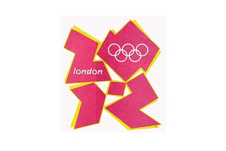
I am going to continue the spirit by posting another entry relating to the Olympic games. Recently, on Scott Hansen's blog (www.iso50.com), he wrote a post about the branding of Olympic games. Obviously, art and design is subjective, so his post was basically commentary about Olympic Logo Designs. He scanned some Olympic Logos in which he considers to be of the modern era. This begins with the Paris Olympic games in 1924, to Amsterdam 1928, Los Angeles 1932, Berlin 1936, (then he misses 12 years), then London 1948, Helsinki 1952, etc. etc. etc. Hansen ends at the London 2012 games (which is the Location of the next Summer Olympics). This logo is completely different from all the previous logos (check Scott Hansen's blog post here). The trend that this logo mimics is of the late 80s and 90s, which the bright colors and gaged lines. Even the Olympic rings are different because they're just white rather than the colors blue, yellow, black, green and red. The typeface... which I'm not really sure about... is most definitely ... not a popular typeface of this era. I find this logo to be kind of... risky. But then again, I cannot completely predict what the trend for the general masses will be 4 years from now. We will just have to see.
Subscribe to:
Post Comments (Atom)

No comments:
Post a Comment